组件(Component)是 Vue.js 最强大的功能之一。
组件可以扩展 HTML 元素,封装可重用的代码。
每个 Vue 应用都是通过用 createApp 函数创建的,传递给 createApp 的选项用于配置根组件。当我们挂载应用时,该组件被用作渲染的起点。
一个应用需要被挂载到一个 DOM 元素中。
基本示例
这里有一个 Vue 组件的示例:
// 创建一个Vue 应用
const app = Vue.createApp({})

// 定义一个名为 button-counter 的新全局组件
app.component('button-counter', {
  data() {
    return {
      count: 0
    }
  },
  template: `
    <button @click="count++">
      You clicked me {{ count }} times.
    </button>`
})
在这里演示的是一个简单的示例,但是在典型的 Vue 应用中,我们使用单文件组件而不是字符串模板。
组件是带有名称的可复用实例,在这个例子中是 <button-counter>。我们可以把这个组件作为一个根实例中的自定义元素来使用:
<div id="components-demo">
  <button-counter></button-counter>
</div>

//js
app.mount('#components-demo')
看下DEMO:
<!DOCTYPE html>
<html lang="en">
<head>
    <meta charset="UTF-8">
    <meta http-equiv="X-UA-Compatible" content="IE=edge">
    <meta name="viewport" content="width=device-width, initial-scale=1.0">
    <title>组件 | Web176教程(web176.com)</title>
    <style>
      .demo {
        font-family: sans-serif;
        border: 1px solid #eee;
        border-radius: 2px;
        padding: 20px 30px;
        margin-top: 1em;
        margin-bottom: 40px;
        user-select: none;
        overflow-x: auto;
      }
    </style>
</head>
<body>
  <div id="components-demo">
    <button-counter></button-counter>
  </div>

<script src='https://unpkg.com/vue@next'></script>
<script>
       // Create a Vue application
        const app = Vue.createApp({})

        // Define a new global component called button-counter
        app.component('button-counter', {
          data() {
            return {
              count: 0
            }
          },
          template: `
            <button v-on:click="count++">
              You clicked me {{ count }} times.
            </button>`
        })

        app.mount('#components-demo')
</script>
</body>
</html>
因为组件是可复用的实例,所以它们与根实例接收相同的选项,例如 data、computed、watch、methods 以及生命周期钩子等。
组件的复用
你可以将组件进行任意次数的复用:
<div id="components-demo">
  <button-counter></button-counter>
  <button-counter></button-counter>
  <button-counter></button-counter>
</div>
看下DEMO:
<!DOCTYPE html>
<html lang="en">
<head>
    <meta charset="UTF-8">
    <meta http-equiv="X-UA-Compatible" content="IE=edge">
    <meta name="viewport" content="width=device-width, initial-scale=1.0">
    <title>组件 | Web176教程(web176.com)</title>
    <style>
      .demo {
        font-family: sans-serif;
        border: 1px solid #eee;
        border-radius: 2px;
        padding: 20px 30px;
        margin-top: 1em;
        margin-bottom: 40px;
        user-select: none;
        overflow-x: auto;
      }
    </style>
</head>
<body>
  <div id="components-demo">
    <button-counter></button-counter>
    <button-counter></button-counter>
    <button-counter></button-counter>
  </div>

<script src='https://unpkg.com/vue@next'></script>
<script>
    // Create a Vue application
    const app = Vue.createApp({})

    // Define a new global component called button-counter
    app.component('button-counter', {
      data() {
        return {
          count: 0
        }
      },
      template: `
        <button v-on:click="count++">
          You clicked me {{ count }} times.
        </button>`
    })

    app.mount('#components-demo')
</script>
</body>
</html>
注意当点击按钮时,每个组件都会各自独立维护它的 count。因为你每用一次组件,就会有一个它的新实例被创建。
组件的组织
通常一个应用会以一棵嵌套的组件树的形式来组织:
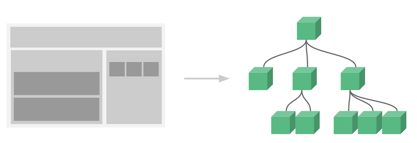

例如,你可能会有页头、侧边栏、内容区等组件,每个组件又包含了其它的像导航链接、博文之类的组件。
为了能在模板中使用,这些组件必须先注册以便 Vue 能够识别。这里有两种组件的注册类型:全局注册和局部注册。至此,我们的组件都只是通过 component 方法全局注册的:
const app = Vue.createApp({})

app.component('my-component-name', {
  // ... 选项 ...
})
全局注册的组件可以在应用中的任何组件的模板中使用。
到目前为止,关于组件注册你需要了解的就这些了,如果你阅读完本页内容并掌握了它的内容,我们会推荐你再回来把组件注册读完。
通过 Prop 向子组件传递数据
早些时候,我们提到了创建一个博文组件的事情。问题是如果你不能向这个组件传递某一篇博文的标题或内容之类的我们想展示的数据的话,它是没有办法使用的。这也正是 prop 的由来。
Prop 是你可以在组件上注册的一些自定义 attribute。为了给博文组件传递一个标题,我们可以用 props 选项将其包含在该组件可接受的 prop 列表中:
const app = Vue.createApp({})

app.component('blog-post', {
  props: ['title'],
  template: `<h4>{{ title }}</h4>`
})

app.mount('#blog-post-demo')
当一个值被传递给一个 prop attribute 时,它就成为该组件实例中的一个 property。该 property 的值可以在模板中访问,就像任何其他组件 property 一样。
一个组件可以拥有任意数量的 prop,并且在默认情况下,无论任何值都可以传递给 prop。
<div id="blog-post-demo" class="demo">
  <blog-post title="My journey with Vue"></blog-post>
  <blog-post title="Blogging with Vue"></blog-post>
  <blog-post title="Why Vue is so fun"></blog-post>
</div>
看下DEMO:
<!DOCTYPE html>
<html lang="en">
<head>
    <meta charset="UTF-8">
    <meta http-equiv="X-UA-Compatible" content="IE=edge">
    <meta name="viewport" content="width=device-width, initial-scale=1.0">
    <title>组件 | Web176教程(web176.com)</title>
    <style>
      .demo {
        font-family: sans-serif;
        border: 1px solid #eee;
        border-radius: 2px;
        padding: 20px 30px;
        margin-top: 1em;
        margin-bottom: 40px;
        user-select: none;
        overflow-x: auto;
      }
    </style>
</head>
<body>
  <div id="blog-post-demo" class="demo">
    <blog-post title="My journey with Vue"></blog-post>
    <blog-post title="Blogging with Vue"></blog-post>
    <blog-post title="Why Vue is so fun"></blog-post>
  </div>

<script src='https://unpkg.com/vue@next'></script>
<script>
    const app = Vue.createApp({})

    app.component('blog-post', {
      props: ['title'],
      template: `<h4>{{ title }}</h4>`
    })

    app.mount('#blog-post-demo')
</script>
</body>
</html>
然而在一个典型的应用中,你可能在 data 里有一个博文的数组:
const App = {
  data() {
    return {
      posts: [
        { id: 1, title: 'My journey with Vue' },
        { id: 2, title: 'Blogging with Vue' },
        { id: 3, title: 'Why Vue is so fun' }
      ]
    }
  }
}

const app = Vue.createApp(App)

app.component('blog-post', {
  props: ['title'],
  template: `<h4>{{ title }}</h4>`
})

app.mount('#blog-posts-demo')
并想要为每篇博文渲染一个组件:
<div id="blog-posts-demo">
  <blog-post
    v-for="post in posts"
    :key="post.id"
    :title="post.title"
  ></blog-post>
</div>
如上所示,你会发现我们可以使用 v-bind 来动态传递 prop。这在你一开始不清楚要渲染的具体内容,是非常有用的。
到目前为止,关于 prop 你需要了解的大概就这些了,如果你阅读完本页内容并掌握了它的内容,我们会推荐你再回来把 Props 读完。
监听子组件事件
我们在开发 <blog-post> 组件时,它的一些功能可能需要与父级组件进行沟通。例如我们可能会引入一个辅助功能来放大博文的字号,同时让页面的其它部分保持默认的字号。
在其父组件中,我们可以通过添加一个 postFontSize data property 来支持这个功能:
const App = {
  data() {
    return {
      posts: [
        /* ... */
      ],
      postFontSize: 1
    }
  }
}
它可以在模板中用来控制所有博文的字号:
<div id="blog-posts-events-demo">
  <div :style="{ fontSize: postFontSize + 'em' }">
    <blog-post
      v-for="post in posts"
      :key="post.id"
      :title="post.title"
    ></blog-post>
  </div>
</div>
现在我们在每篇博文正文之前添加一个按钮来放大字号:
app.component('blog-post', {
  props: ['title'],
  template: `
    <div class="blog-post">
      <h4>{{ title }}</h4>
      <button>
        Enlarge text
      </button>
    </div>
  `
})
问题是这个按钮不会做任何事:
<button>
  Enlarge text
</button>
当点击这个按钮时,我们需要告诉父级组件放大所有博文的文本。幸好组件实例提供了一个自定义事件的系统来解决这个问题。父级组件可以像处理原生 DOM 事件一样通过 v-on 或 @ 监听子组件实例的任意事件:
<blog-post ... @enlarge-text="postFontSize += 0.1"></blog-post>同时子组件可以通过调用内建的 $emit 方法并传入事件名称来触发一个事件:
<button @click="$emit('enlargeText')">
  Enlarge text
</button>
多亏了 @enlarge-text="postFontSize += 0.1" 监听器,父级组件能够接收事件并更新 postFontSize 的值。
<!DOCTYPE html>
<html lang="en">
<head>
    <meta charset="UTF-8">
    <meta http-equiv="X-UA-Compatible" content="IE=edge">
    <meta name="viewport" content="width=device-width, initial-scale=1.0">
    <title>组件 | Web176教程(web176.com)</title>
    <style>
      .demo {
        font-family: sans-serif;
        border: 1px solid #eee;
        border-radius: 2px;
        padding: 20px 30px;
        margin-top: 1em;
        margin-bottom: 40px;
        user-select: none;
        overflow-x: auto;
      }
    </style>
</head>
<body>
  <div id="blog-posts-events-demo" class="demo">
    <div :style="{ fontSize: postFontSize + 'em' }">
      <blog-post
         v-for="post in posts"
         :key="post.id"
         :title="post.title"
         @enlarge-text="postFontSize += 0.1"
      ></blog-post>
    </div>
  </div>

<script src='https://unpkg.com/vue@next'></script>
<script>
    const app = Vue.createApp({
    data() {
      return {
        posts: [
          { id: 1, title: 'My journey with Vue'},
          { id: 2, title: 'Blogging with Vue'},
          { id: 3, title: 'Why Vue is so fun'}
        ],
        postFontSize: 1
      }
    }
  })

  app.component('blog-post', {
    props: ['title'],
    template: `
      <div class="blog-post">
        <h4>{{ title }}</h4>
        <button @click="$emit('enlargeText')">
          Enlarge text
        </button>
      </div>
    `
  })

  app.mount('#blog-posts-events-demo')
</script>
</body>
</html>
我们可以在组件的 emits 选项中列出已抛出的事件:
app.component('blog-post', {
  props: ['title'],
  emits: ['enlargeText']
})
这将允许我们检查组件抛出的所有事件,还可以选择验证它们。
使用事件抛出一个值
有的时候用一个事件来抛出一个特定的值是非常有用的。例如我们可能想让 <blog-post> 组件决定它的文本要放大多少。这时可以使用 $emit 的第二个参数来提供这个值:
<button @click="$emit('enlargeText', 0.1)">
  Enlarge text
</button>
然后当在父级组件监听这个事件的时候,我们可以通过 $event 访问到被抛出的这个值:
<blog-post ... @enlarge-text="postFontSize += $event"></blog-post>
或者,如果这个事件处理函数是一个方法:
<blog-post ... @enlarge-text="onEnlargeText"></blog-post>
那么这个值将会作为第一个参数传入这个方法:
methods: {
  onEnlargeText(enlargeAmount) {
    this.postFontSize += enlargeAmount
  }
}
在组件上使用 v-model
自定义事件也可以用于创建支持 v-model 的自定义输入组件。记住:
<input v-model="searchText" />
等价于:
<input :value="searchText" @input="searchText = $event.target.value" />
当用在组件上时,v-model 则会这样:
<custom-input
  :model-value="searchText"
  @update:model-value="searchText = $event"
></custom-input>
请注意,我们在这里使用的是
model-value,因为我们使用的是 DOM 模板中的 kebab-case。你可以在解析 DOM 模板时的注意事项部分找到关于 kebab cased 和 camelCased 属性的详细说明。
为了让它正常工作,这个组件内的 <input> 必须:
- 将其
valueattribute 绑定到一个名叫modelValue的 prop 上 - 在其
input事件被触发时,将新的值通过自定义的update:modelValue事件抛出
写成代码之后是这样的:
app.component('custom-input', {
  props: ['modelValue'],
  emits: ['update:modelValue'],
  template: `
    <input
      :value="modelValue"
      @input="$emit('update:modelValue', $event.target.value)"
    >
  `
})
现在 v-model 就可以在这个组件上完美地工作起来了:
<custom-input v-model="searchText"></custom-input>
在该组件中实现 v-model 的另一种方法是使用 computed property 的功能来定义 getter 和 setter。get 方法应返回 modelValue property,set 方法应该触发相应的事件。
app.component('custom-input', {
  props: ['modelValue'],
  emits: ['update:modelValue'],
  template: `
    <input v-model="value">
  `,
  computed: {
    value: {
      get() {
        return this.modelValue
      },
      set(value) {
        this.$emit('update:modelValue', value)
      }
    }
  }
})
现在你只需要了解自定义组件事件,但一旦你读完本页并对其内容还觉得不错,我们建议你稍后再阅读有关自定义事件的完整指南。
通过插槽分发内容
和 HTML 元素一样,我们经常需要向一个组件传递内容,像这样:
<alert-box>
  Something bad happened.
</alert-box>
看下DEMO,可能会渲染出这样的东西:
<!DOCTYPE html>
<html lang="en">
<head>
    <meta charset="UTF-8">
    <meta http-equiv="X-UA-Compatible" content="IE=edge">
    <meta name="viewport" content="width=device-width, initial-scale=1.0">
    <title>组件 | Web176教程(web176.com)</title>
    <style>
      .demo {
        font-family: sans-serif;
        border: 1px solid #eee;
        border-radius: 2px;
        padding: 20px 30px;
        margin-top: 1em;
        margin-bottom: 40px;
        user-select: none;
        overflow-x: auto;
      }
    </style>
</head>
<body>
  <div id="slots-demo" class="demo">
    <alert-box>
      Something bad happened.
    </alert-box>
  </div>

<script src='https://unpkg.com/vue@next'></script>
<script>
    const app = Vue.createApp({})

    app.component('alert-box', {
      template: `
        <div class="demo-alert-box">
          <strong>Error!</strong>
          <slot></slot>
        </div>
      `
    })

    app.mount('#slots-demo')
</script>
</body>
</html>
这可以通过使用 Vue 的自定义 <slot> 元素来实现:
app.component('alert-box', {
  template: `
    <div class="demo-alert-box">
      <strong>Error!</strong>
      <slot></slot>
    </div>
  `
})
如你所见,我们使用 <slot> 作为我们想要插入内容的占位符——就这么简单!
到目前为止,关于插槽你需要了解的大概就这些了,如果你阅读完本页内容并掌握了它的内容,我们会推荐你再回来把插槽读完。
动态组件
有的时候,在不同组件之间进行动态切换是非常有用的,比如在一个多标签的界面里:
<!DOCTYPE html>
<html lang="en">
<head>
    <meta charset="UTF-8">
    <meta http-equiv="X-UA-Compatible" content="IE=edge">
    <meta name="viewport" content="width=device-width, initial-scale=1.0">
    <title>组件 | Web176教程(web176.com)</title>
    <style>
      .demo {
        font-family: sans-serif;
        border: 1px solid #eee;
        border-radius: 2px;
        padding: 20px 30px;
        margin-top: 1em;
        margin-bottom: 40px;
        user-select: none;
        overflow-x: auto;
      }
    </style>
</head>
<body>
  <div id="dynamic-component-demo" class="demo">
    <button
       v-for="tab in tabs"
       v-bind:key="tab"
       v-bind:class="['tab-button', { active: currentTab === tab }]"
       v-on:click="currentTab = tab"
     >
      {{ tab }}
    </button>

    <component v-bind:is="currentTabComponent" class="tab"></component>
  </div>

<script src='https://unpkg.com/vue@next'></script>
<script>
    const app = Vue.createApp({
    data() {
      return {
        currentTab: 'Home',
        tabs: ['Home', 'Posts', 'Archive']
      }
    },
    computed: {
      currentTabComponent() {
        return 'tab-' + this.currentTab.toLowerCase()
      }
    }
  })

  app.component('tab-home', {
    template: `<div class="demo-tab">Home component</div>`
  })
  app.component('tab-posts', {
    template: `<div class="demo-tab">Posts component</div>`
  })
  app.component('tab-archive', {
    template: `<div class="demo-tab">Archive component</div>`
  })

  app.mount('#dynamic-component-demo')
</script>
</body>
</html>
上述内容可以通过 Vue 的 <component> 元素加一个特殊的 is attribute 来实现:
<!-- 组件会在 `currentTabComponent` 改变时改变 -->
<component :is="currentTabComponent"></component>
在上述示例中,currentTabComponent 可以包括:
- 已注册组件的名字,或
- 一个组件选项对象
你也可以使用 is attribute 来创建常规的 HTML 元素。
到目前为止,关于动态组件你需要了解的大概就这些了,如果你阅读完本页内容并掌握了它的内容,我们会推荐你再回来把动态 & 异步组件读完。
解析 DOM 模板时的注意事项
如果想在 DOM 中直接书写 Vue 模板,Vue 将不得不从 DOM 中获取字符串。这会因为浏览器的原生 HTML 解析行为而导致一些小问题。
应该注意的是,下面讨论的限制仅适用于直接在 DOM 中编写模板的情况。它们不适用于以下来源的字符串模板:
- 字符串模板 (比如
template: '...') - 单文件组件
<script type="text/x-template">
元素位置受限
有些 HTML 元素,诸如 <ul>、<ol>、<table> 和 <select>,对于哪些元素可以出现在其内部是有严格限制的。而有些元素,诸如 <li>、<tr> 和 <option>,只能出现在其它某些特定的元素内部。
这会导致我们使用这些有约束条件的元素时遇到一些问题。例如:
<table>
  <blog-post-row></blog-post-row>
</table>
这个自定义组件 <blog-post-row> 会被作为无效的内容提升到外部,并导致最终渲染结果出错。我们可以使用特殊的 is attribute 作为一个变通的办法:
<table>
  <tr is="vue:blog-post-row"></tr>
</table>
当它用于原生 HTML 元素时,
is的值必须以vue:开头,才可以被解释为 Vue 组件。这是避免和原生自定义元素 混淆。
大小写不敏感
另外,HTML attribute 名不区分大小写,因此浏览器将所有大写字符解释为小写。这意味着当你在 DOM 模板中使用时,驼峰 prop 名称和 event 处理器参数需要使用它们的 kebab-cased (横线字符分隔) 等效值:
//  在 JavaScript 中是驼峰式

app.component('blog-post', {
  props: ['postTitle'],
  template: `
    <h3>{{ postTitle }}</h3>
  `
})
<!-- 在 HTML 中则是横线字符分割 -->
<blog-post post-title="hello!"></blog-post>
到这里,你需要了解的解析 DOM 模板时的注意事项——实际上也是 Vue 的全部必要内容,大概就是这些了。恭喜你!接下来还有很多东西要去学习,不过首先,我们推荐你先休息一下,试用一下 Vue,自己随意做些好玩的东西。
如果你感觉已经掌握了这些知识,我们推荐你再回来把完整的组件&异步组件指南,包括侧边栏中组件深入章节的所有页面读完。
作者:terry,如若转载,请注明出处:https://www.web176.com/vue3/6257.html
 支付宝
支付宝  微信
微信 