Vue 提供了一些抽象概念,可以帮助处理过渡和动画,特别是在响应某些变化时。这些抽象的概念包括:
- 组件进入和离开 DOM 的钩子,在 CSS 和 JS 中均可用,使用内置的
<transition>组件。 - 过渡模式,以便你在过渡期间编排顺序。
- 处理多个元素就地更新的钩子,使用
<transition-group>组件,通过 FLIP 技术来提高性能。 - 使用
watchers来处理应用中不同状态的过渡。
我们将在本指南接下来的三个部分中介绍所有这些以及更多内容。然而,除了提供这些有用的 API 之外,值得一提的是,我们前面介绍的 class 和 style 声明也可以应用于动画和过渡,用于更简单的用例。
在下一节中,我们将回顾一些 web 动画和过渡的基础知识,并提供一些资源链接以进行进一步的研究。如果你已经熟悉 web 动画,并且了解这些原理如何与 Vue 的某些指令配合使用,可以跳过这一节。如果希望在开始学习之前进一步了解 web 动画基础知识,请继续阅读。
基于 class 的动画和过渡
尽管 <transition> 组件对于组件的进入和离开非常有用,但你也可以通过添加一个条件 class 来激活动画,而无需挂载组件。
我们看个简单例子:
<div id="demo">
  Push this button to do something you shouldn't be doing:<br />

  <div :class="{ shake: noActivated }">
    <button @click="noActivated = true">Click me</button>
    <span v-if="noActivated">Oh no!</span>
  </div>
</div>
.shake {
  animation: shake 0.82s cubic-bezier(0.36, 0.07, 0.19, 0.97) both;
  transform: translate3d(0, 0, 0);
  backface-visibility: hidden;
  perspective: 1000px;
}

@keyframes shake {
  10%,
  90% {
    transform: translate3d(-1px, 0, 0);
  }

  20%,
  80% {
    transform: translate3d(2px, 0, 0);
  }

  30%,
  50%,
  70% {
    transform: translate3d(-4px, 0, 0);
  }

  40%,
  60% {
    transform: translate3d(4px, 0, 0);
  }
}
const Demo = {
  data() {
    return {
      noActivated: false
    }
  }
}

Vue.createApp(Demo).mount('#demo')
完整DEMO如下:
<!DOCTYPE html>
<html lang="en">
<head>
    <meta charset="UTF-8">
    <meta http-equiv="X-UA-Compatible" content="IE=edge">
    <meta name="viewport" content="width=device-width, initial-scale=1.0">
    <title>动画 | Web176教程(web176.com)</title>
    <style>
       .shake {
        animation: shake 0.82s cubic-bezier(0.36, 0.07, 0.19, 0.97) both;
        transform: translate3d(0, 0, 0);
        backface-visibility: hidden;
        perspective: 1000px;
        }

        @keyframes shake {
        10%,
        90% {
            transform: translate3d(-1px, 0, 0);
        }

        20%,
        80% {
            transform: translate3d(2px, 0, 0);
        }

        30%,
        50%,
        70% {
            transform: translate3d(-4px, 0, 0);
        }

        40%,
        60% {
            transform: translate3d(4px, 0, 0);
        }
        }

    </style>
</head>
<body>


    <div id="demo">
        Push this button to do something you shouldn't be doing:<br />

        <div :class="{ shake: noActivated }">
          <button @click="noActivated = true">Click me</button>
          <span v-if="noActivated">Oh no!</span>
        </div>
      </div>

<script src='https://unpkg.com/vue@next'></script>
<script>
       const Demo = {
        data() {
            return {
            noActivated: false
            }
        }
        }

        Vue.createApp(Demo).mount('#demo')

</script>
</body>
</html>
大家运行试试吧。
过渡与 Style 绑定
一些过渡效果可以通过插值的方式来实现,例如在发生交互时将样式绑定到元素上。以这个例子为例:
<!DOCTYPE html>
<html lang="en">
<head>
    <meta charset="UTF-8">
    <meta http-equiv="X-UA-Compatible" content="IE=edge">
    <meta name="viewport" content="width=device-width, initial-scale=1.0">
    <title>动画 | Web176教程(web176.com)</title>
    <style>
       .movearea {
  transition: 0.2s background-color ease;
}


    </style>
</head>
<body>


    <div id="demo">
        <div
          @mousemove="xCoordinate"
          :style="{ backgroundColor: `hsl(${x}, 80%, 50%)` }"
          class="movearea"
        >
          <h3>Move your mouse across the screen...</h3>
          <p>x: {{x}}</p>
        </div>
      </div>


<script src='https://unpkg.com/vue@next'></script>
<script>
       const Demo = {
        data() {
            return {
            x: 0
            }
        },
        methods: {
            xCoordinate(e) {
            this.x = e.clientX
            }
        }
        }

        Vue.createApp(Demo).mount('#demo')


</script>
</body>
</html>
在这个例子中,我们是通过使用插值来创建动画,将触发条件添加到鼠标的移动过程上。同时将 CSS 过渡属性应用在元素上,让元素知道在更新时要使用什么过渡效果。
性能
你可能注意到上面显示的动画使用了 transforms 之类的东西,并应用了诸如 perspective 之类的奇怪的 property——为什么它们是这样实现的,而不是仅仅使用 margin 和 top 等?
通过关注性能表现,我们可以在 web 上创建极其流畅的动画。我们希望尽可能对元素动画进行硬件加速,并使用不触发重绘的 property。我们来介绍一下如何实现这个目标。
Transform 和 Opacity
我们可以通过工具,例如 CSS Triggers
来查看哪些属性会在动画时触发重绘。在工具中,查看 transform 的相关内容,你将看到:
非常好的是,更改 transform 不会触发任何几何形状变化或绘制。这意味着该操作可能是由合成器线程在 GPU 的帮助下执行。
opacity 属性的行为也类似。因此,他们是在 web 上做元素移动的理想选择。
硬件加速
诸如 perspective、backface-visibility 和 transform:translateZ(x) 等 property 将让浏览器知道你需要硬件加速。
如果要对一个元素进行硬件加速,可以应用以下任何一个 property (并不是需要全部,任意一个就可以):
perspective: 1000px;
backface-visibility: hidden;
transform: translateZ(0);
许多像 GreenSock 这样的 JS 库都会默认你需要硬件加速,并在默认情况下应用,所以你不需要手动设置它们。
时长
对于简单 UI 过渡,即从一个状态到另一个没有中间状态的状态,通常使用 0.1s 到 0.4s 之间的计时,大多数人发现 0.25s 是一个最佳选择。你能用这个定时做任何事情吗?并不能。如果你有一些元素需要移动更大的距离,或者有更多的步骤或状态变化,0.25s 的效果可能会不好,你将不得不更加用心,而且定时也需要更加独特。但这并不意味着你不能在应用中重复使用效果好的默认值。
你也可能会发现,起始动画比结束动画的时间稍长一些,看起来会更好一些。用户通常是在动画开始时被引导的,而在动画结束时没有那么多耐心,因为他们想继续他们的动作。
缓动效果
缓动效果是在动画中表达深度的一个重要方式。动画新手最常犯的一个错误是在起始动画节点使用 ease-in,在结束动画节点使用 ease-out。实际上你需要的是反过来的。
如果我们将这些状态应用于过渡,它应该像这样:
.button {
  background: #1b8f5a;
  /* 应用于初始状态,因此此转换将应用于返回状态 */
  transition: background 0.25s ease-in;
}

.button:hover {
  background: #3eaf7c;
  /* 应用于悬停状态,因此在触发悬停时将应用此过渡 */
  transition: background 0.35s ease-out;
}
我们来看个具体例子吧。
<!DOCTYPE html>
<html lang="en">
<head>
    <meta charset="UTF-8">
    <meta http-equiv="X-UA-Compatible" content="IE=edge">
    <meta name="viewport" content="width=device-width, initial-scale=1.0">
    <title>动画 | Web176教程(web176.com)</title>
    <style>
      body {
        display: flex;
        justify-content: center;
        align-items: center;
        margin: 40px;
        }

        .button {
        background: #1b8f5a;
        transition: background 0.25s ease-in;
        border-radius: 4px;
        display: inline-block;
        border: none;
        padding: 0.75rem 1rem;
        margin: 0;
        text-decoration: none;
        color: #ffffff;
        font-family: sans-serif;
        font-size: 1rem;
        cursor: pointer;
        text-align: center;
        -webkit-appearance: none;
        -moz-appearance: none;
        }

        button:hover,
        button:focus {
        transition: background 0.3s ease-out;
        background: #3eaf7c;
        }

        button:focus {
        outline: 1px solid #fff;
        outline-offset: -4px;
        }
    </style>
</head>
<body>


    <div id="app">
        <button class="button">
          {{ message }}
        </button>
      </div>


<script src='https://unpkg.com/vue@next'></script>
<script>
       const ButtonApp = {
        data() {
            return {
            message: 'Hover Me!'
            }
        }
        }

        Vue.createApp(ButtonApp).mount('#app')


</script>
</body>
</html>
缓动效果也可以用来表达动画元素的材质。以下面的 pen 为例,你认为哪个球是硬的,哪个球是软的?
<!DOCTYPE html>
<html lang="en">
<head>
    <meta charset="UTF-8">
    <meta http-equiv="X-UA-Compatible" content="IE=edge">
    <meta name="viewport" content="width=device-width, initial-scale=1.0">
    <title>动画 | Web176教程(web176.com)</title>
    <style>
      @import "compass/css3";

html {
  background: #222;
}

.container {
  width: 500px;
  margin: 10px auto;
  border: 1px solid #333;
  height: 280px;
  background: #111;
  overflow: hidden;
}

.unit {
  float:left;
  width: 249px;
  height: 280px;
  background-color: #222426; // Old browsers
  @include filter-gradient(#222426, #111111, horizontal); // IE6-9 fallback on horizontal gradient
  @include background-image(radial-gradient(center, ellipse cover, #222426 0%,#111111 100%));
  &:first-child {
    border-right: 1px solid #333;
  }
}

.overlay {
  position: absolute;
  background-image: url("https://s3-us-west-2.amazonaws.com/s.cdpn.io/28963/grain.png");
  top: 10px;
  width: 500px;
  height: 280px;
  left: 50%;
  margin-left: -250px;
  z-index: 1000;
  opacity: 0.11;
  animation: filmgrain 0.4s steps(3) infinite;
}

.ball {
  width: 30px;
  height: 30px;
  border-radius: 50%;
  background-color: #959595; // Old browsers
@include filter-gradient(#959595, #494949, horizontal); // IE6-9 fallback on horizontal gradient
@include background-image(radial-gradient(center, ellipse cover, #959595 0%,#4e4e4e 79%,#494949 100%));
  transform: translateZ(0);
  margin: 30px auto;
  position: relative;
  z-index: 300;
}

.ball-shadow {
  position: absolute;
  width: 50px;
  height: 5px;
  border-radius: 50%;
  background: #000;
  top: 280px;
  margin-left: 100px;
  z-index: 2;
  opacity: 0;
  box-shadow: 0 0 10px 5px rgba(0,0,0,0.2);
  animation: boom 1.6s 0.7s ease-in-out infinite;
}

@keyframes boom {
  50% { opacity: 0.8; }
}

@keyframes filmgrain {
  100% { background-position: 200% 0%; }
}
    </style>
</head>
<body>


    <div class='container'>
        <div class='unit'>
          <div class='ball ball1'></div>
          <div class='ball-shadow'></div>
        </div>
        <div class='unit'>
          <div class='ball ball2'></div>
          <div class='ball-shadow'></div>
        </div>
      </div>
      <div class='overlay'></div>


<script src='https://unpkg.com/vue@next'></script>
<script>
       const ball1 = document.querySelector('.ball1')
        const ball2 = document.querySelector('.ball2')

        gsap.from(ball1, {
        duration: 0.8,
        y: 220,
        repeat: -1,
        yoyo: true,
        ease: Power4.easeOut
        });
        gsap.from(ball2, {
        duration: 0.8,
        y: 225,
        repeat: -1,
        yoyo: true,
        ease: Circ.easeOut
        });
        gsap.fromTo(ball2, {
        duration: 0.8,
        scaleY: 1
        }, {
        scaleY: 1.1,
        repeat: -1,
        yoyo: true,
        ease: Circ.easeOut
        });


</script>
</body>
</html>
你可以通过调整你的缓动函数来获得很多独特的效果,使动画非常炫酷。CSS 允许你通过调整 cubic-bezier 函数的参数来修改缓动效果,Lea Verou 的这个 playground ,对探索这个问题非常有帮助。
虽然可以通过三次贝塞尔曲线提供的两个控制点为简单动画实现很好的效果,但 JavaScript 允许使用多个控制点,因此也支持更多的变化。
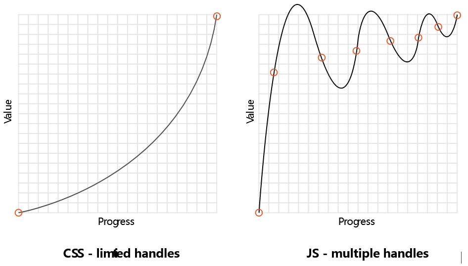

以弹跳为例。在 CSS 中,我们必须声明向上和向下的每个关键帧。在 JavaScript 中,我们可以通过在 GreenSock API (GSAP)
中声明 bounce 来描述缓动效果中的所有这些移动 (其他 JS 库有其他类型的缓动效果默认值)。
这里是 CSS 中用来实现 bounce 的代码 (来自 animate.css 的例子):
@keyframes bounceInDown {
  from,
  60%,
  75%,
  90%,
  to {
    animation-timing-function: cubic-bezier(0.215, 0.61, 0.355, 1);
  }

  0% {
    opacity: 0;
    transform: translate3d(0, -3000px, 0) scaleY(3);
  }

  60% {
    opacity: 1;
    transform: translate3d(0, 25px, 0) scaleY(0.9);
  }

  75% {
    transform: translate3d(0, -10px, 0) scaleY(0.95);
  }

  90% {
    transform: translate3d(0, 5px, 0) scaleY(0.985);
  }

  to {
    transform: translate3d(0, 0, 0);
  }
}

.bounceInDown {
  animation-name: bounceInDown;
}
下面是 JS 中使用 GreenSock 实现相同的 bounce:
gsap.from(element, { duration: 1, ease: 'bounce.out', y: -500 })好吧,关于动画的介绍就这么多内容,下节课我们学习过渡和动画的其他内容吧。
作者:terry,如若转载,请注明出处:https://www.web176.com/vue3/6222.html
 支付宝
支付宝  微信
微信 