在插入、更新或从 DOM 中移除项时,Vue 提供了多种应用转换效果的方法。这包括以下工具:
- 自动为 CSS 过渡和动画应用 class;
- 集成第三方 CSS 动画库,例如 animate.css;
- 在过渡钩子期间使用 JavaScript 直接操作 DOM;
- 集成第三方 JavaScript 动画库。
在这里,我们只介绍进入、离开的过渡,你也可以从下一节中学习列表过渡和管理过渡状态 。
单元素/组件的过渡
Vue 提供了 transition 的封装组件,在下列情形中,可以给任何元素和组件添加进入/离开过渡
- 条件渲染 (使用
v-if) - 条件展示 (使用
v-show) - 动态组件
- 组件根节点
这里是一个典型的例子:
<div id="demo">
  <button @click="show = !show">
    Toggle
  </button>

  <transition name="fade">
    <p v-if="show">hello</p>
  </transition>
</div>
const Demo = {
data() {
return {
show: true
}
}
}
Vue.createApp(Demo).mount('#demo')
.fade-enter-active,
.fade-leave-active {
transition: opacity 0.5s ease;
}
.fade-enter-from,
.fade-leave-to {
opacity: 0;
}完整DEMO如下:
<!DOCTYPE html>
<html lang="en">
<head>
<meta charset="UTF-8">
<meta http-equiv="X-UA-Compatible" content="IE=edge">
<meta name="viewport" content="width=device-width, initial-scale=1.0">
<title>列表过渡 | Web176教程(web176.com)</title>
<style>
.fade-enter-active,
.fade-leave-active {
transition: opacity 0.5s ease;
}
.fade-enter-from,
.fade-leave-to {
opacity: 0;
}
</style>
</head>
<body>
<div id="demo">
<button @click="show = !show">
Toggle
</button>
<transition name="fade">
<p v-if="show">hello</p>
</transition>
</div>
<script src='https://unpkg.com/vue@next'></script>
<script>
const Demo = {
  data() {
    return {
      show: true
    }
  }
}

Vue.createApp(Demo).mount('#demo')
</script>
</body>
</html>当插入或删除包含在 transition 组件中的元素时,Vue 将会做以下处理:
- 自动嗅探目标元素是否应用了 CSS 过渡或动画,如果是,在恰当的时机添加/删除 CSS 类名。
- 如果过渡组件提供了 JavaScript 钩子函数 ,这些钩子函数将在恰当的时机被调用。
- 如果没有找到 JavaScript 钩子并且也没有检测到 CSS 过渡/动画,DOM 操作 (插入/删除) 在下一帧中立即执行。(注意:此处指浏览器逐帧动画机制,和 Vue 的
nextTick概念不同)
过渡 class
在进入/离开的过渡中,会有 6 个 class 切换。
v-enter-from:定义进入过渡的开始状态。在元素被插入之前生效,在元素被插入之后的下一帧移除。v-enter-active:定义进入过渡生效时的状态。在整个进入过渡的阶段中应用,在元素被插入之前生效,在过渡/动画完成之后移除。这个类可以被用来定义进入过渡的过程时间,延迟和曲线函数。v-enter-to:定义进入过渡的结束状态。在元素被插入之后下一帧生效 (与此同时v-enter-from被移除),在过渡/动画完成之后移除。v-leave-from:定义离开过渡的开始状态。在离开过渡被触发时立刻生效,下一帧被移除。v-leave-active:定义离开过渡生效时的状态。在整个离开过渡的阶段中应用,在离开过渡被触发时立刻生效,在过渡/动画完成之后移除。这个类可以被用来定义离开过渡的过程时间,延迟和曲线函数。v-leave-to:离开过渡的结束状态。在离开过渡被触发之后下一帧生效 (与此同时v-leave-from被移除),在过渡/动画完成之后移除。
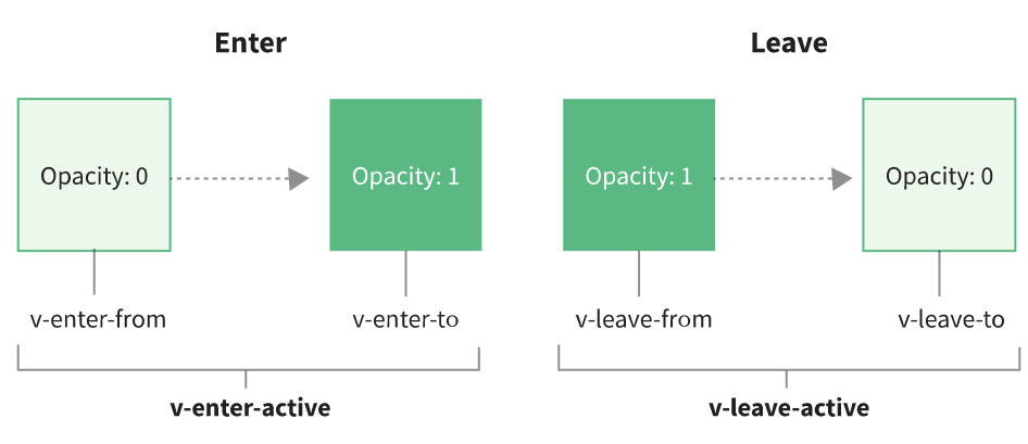

这里的每个 class 都将以过渡的名字添加前缀。如果你使用了一个没有名字的 <transition>,则 v- 是这些 class 名的默认前缀。举例来说,如果你使用了 <transition name="my-transition">,那么 v-enter-from 会替换为 my-transition-enter-from。
v-enter-active 和 v-leave-active 可以控制进入/离开过渡的不同的缓和曲线,在下面章节会有个示例说明。
CSS 过渡
CSS 过渡是最常用的过渡类型之一。举例:
<div id="demo">
  <button @click="show = !show">
    Toggle render
  </button>

  <transition name="slide-fade">
    <p v-if="show">hello</p>
  </transition>
</div>
const Demo = {
data() {
return {
show: true
}
}
}
Vue.createApp(Demo).mount('#demo')/* 可以为进入和离开动画设置不同的持续时间和动画函数 */
.slide-fade-enter-active {
transition: all 0.3s ease-out;
}
.slide-fade-leave-active {
transition: all 0.8s cubic-bezier(1, 0.5, 0.8, 1);
}
.slide-fade-enter-from,
.slide-fade-leave-to {
transform: translateX(20px);
opacity: 0;
}完整DEMO如下:
<!DOCTYPE html>
<html lang="en">
<head>
<meta charset="UTF-8">
<meta http-equiv="X-UA-Compatible" content="IE=edge">
<meta name="viewport" content="width=device-width, initial-scale=1.0">
<title>列表过渡 | Web176教程(web176.com)</title>
<style>
/* 可以为进入和离开动画设置不同的持续时间和动画函数 */
.slide-fade-enter-active {
transition: all 0.3s ease-out;
}
.slide-fade-leave-active {
transition: all 0.8s cubic-bezier(1, 0.5, 0.8, 1);
}
.slide-fade-enter-from,
.slide-fade-leave-to {
transform: translateX(20px);
opacity: 0;
}
</style>
</head>
<body>
<div id="demo">
<button @click="show = !show">
Toggle render
</button>
<transition name="slide-fade">
<p v-if="show">hello</p>
</transition>
</div>
<script src='https://unpkg.com/vue@next'></script>
<script>
const Demo = {
  data() {
    return {
      show: true
    }
  }
}

Vue.createApp(Demo).mount('#demo')
</script>
</body>
</html>CSS 动画
CSS 动画用法同 CSS 过渡,区别是在动画中 v-enter-from 类在节点插入 DOM 后不会立即移除,而是在 animationend 事件触发时移除。
下面是一个例子,为了简洁起见,省略了带前缀的 CSS 规则:
<div id="demo">
  <button @click="show = !show">Toggle show</button>
  <transition name="bounce">
    <p v-if="show">
      Lorem ipsum dolor sit amet, consectetur adipiscing elit. Mauris facilisis
      enim libero, at lacinia diam fermentum id. Pellentesque habitant morbi
      tristique senectus et netus.
    </p>
  </transition>
</div>
const Demo = {
  data() {
    return {
      show: true
    }
  }
}

Vue.createApp(Demo).mount('#demo')
.bounce-enter-active {
  animation: bounce-in 0.5s;
}
.bounce-leave-active {
  animation: bounce-in 0.5s reverse;
}
@keyframes bounce-in {
  0% {
    transform: scale(0);
  }
  50% {
    transform: scale(1.25);
  }
  100% {
    transform: scale(1);
  }
}
完整的DEMO如下:
<!DOCTYPE html>
<html lang="en">
<head>
    <meta charset="UTF-8">
    <meta http-equiv="X-UA-Compatible" content="IE=edge">
    <meta name="viewport" content="width=device-width, initial-scale=1.0">
    <title>动画 | Web176教程(web176.com)</title>
    <style>
        .bounce-enter-active {
  animation: bounce-in 0.5s;
}
.bounce-leave-active {
  animation: bounce-in 0.5s reverse;
}
@keyframes bounce-in {
  0% {
    transform: scale(0);
  }
  50% {
    transform: scale(1.25);
  }
  100% {
    transform: scale(1);
  }
}


    </style>
</head>
<body>

    <div id="demo">
        <button @click="show = !show">Toggle show</button>
        <transition name="bounce">
          <p v-if="show">
            Lorem ipsum dolor sit amet, consectetur adipiscing elit. Mauris facilisis
            enim libero, at lacinia diam fermentum id. Pellentesque habitant morbi
            tristique senectus et netus.
          </p>
        </transition>
      </div>


<script src='https://unpkg.com/vue@next'></script>
<script>
        const Demo = {
        data() {
            return {
            show: true
            }
        }
        }

        Vue.createApp(Demo).mount('#demo')


</script>
</body>
</html>
自定义过渡 class 类名
我们可以通过以下 attribute 来自定义过渡类名:
enter-from-classenter-active-classenter-to-classleave-from-classleave-active-classleave-to-class
它们的优先级高于普通的类名,当你希望将其它第三方 CSS 动画库与 Vue 的过渡系统相结合时十分有用,比如 Animate.css 。
示例:
<link
  href="https://cdnjs.cloudflare.com/ajax/libs/animate.css/4.1.0/animate.min.css"
  rel="stylesheet"
  type="text/css"
/>

<div id="demo">
  <button @click="show = !show">
    Toggle render
  </button>

  <transition
    name="custom-classes-transition"
    enter-active-class="animate__animated animate__tada"
    leave-active-class="animate__animated animate__bounceOutRight"
  >
    <p v-if="show">hello</p>
  </transition>
</div>
const Demo = {
  data() {
    return {
      show: true
    }
  }
}

Vue.createApp(Demo).mount('#demo')
完整DEMO如下:
<!DOCTYPE html>
<html lang="en">
<head>
    <meta charset="UTF-8">
    <meta http-equiv="X-UA-Compatible" content="IE=edge">
    <meta name="viewport" content="width=device-width, initial-scale=1.0">
    <title>动画 | Web176教程(web176.com)</title>
    <link
  href="https://cdnjs.cloudflare.com/ajax/libs/animate.css/4.1.0/animate.min.css"
  rel="stylesheet"
  type="text/css"
/>
</head>
<body>

    <div id="demo">
        <button @click="show = !show">
          Toggle render
        </button>

        <transition
          name="custom-classes-transition"
          enter-active-class="animate__animated animate__tada"
          leave-active-class="animate__animated animate__bounceOutRight"
        >
          <p v-if="show">hello</p>
        </transition>
      </div>


<script src='https://unpkg.com/vue@next'></script>
<script>
        const Demo = {
        data() {
            return {
            show: true
            }
        }
        }

        Vue.createApp(Demo).mount('#demo')


</script>
</body>
</html>
同时使用过渡和动画
Vue 为了知道过渡何时完成,必须设置相应的事件监听器。它可以是 transitionend 或 animationend,这取决于给元素应用的 CSS 规则。如果你只使用了其中一种,Vue 能自动识别其正确类型。
但是,在一些场景中,你需要给同一个元素同时设置两种过渡动效,比如有一个通过 Vue 触发的 CSS 动画,并且在悬停时结合一个 CSS 过渡。在这种情况中,你就需要使用 type attribute 并设置 animation 或 transition 来显式声明你需要 Vue 监听的类型。
显性的过渡持续时间
在大多数情况下,Vue 可以自动得出过渡效果的完成时机。默认情况下,Vue 会等待其在过渡效果的根元素的第一个 transitionend 或 animationend 事件。然而,有时候这也许不是预期的行为——比如,我们也许拥有一个精心编排的一系列过渡效果,其中一些嵌套的内部元素相比于过渡效果的根元素具有延迟的或更长的过渡效果。
在这种情况下你可以用 <transition> 组件上的 duration prop 显式指定过渡持续时间 (以毫秒计):
<transition :duration="1000">...</transition>
你也可以分别指定进入和离开的持续时间:
<transition :duration="{ enter: 500, leave: 800 }">...</transition>
JavaScript 钩子
可以在 attribute 中声明 JavaScript 钩子:
<transition
  @before-enter="beforeEnter"
  @enter="enter"
  @after-enter="afterEnter"
  @enter-cancelled="enterCancelled"
  @before-leave="beforeLeave"
  @leave="leave"
  @after-leave="afterLeave"
  @leave-cancelled="leaveCancelled"
  :css="false"
>
  <!-- ... -->
</transition>
JS:
// ...
methods: {
  // --------
  // 进入时
  // --------

  beforeEnter(el) {
    // ...
  },
  // 当与 CSS 结合使用时
  // 回调函数 done 是可选的
  enter(el, done) {
    // ...
    done()
  },
  afterEnter(el) {
    // ...
  },
  enterCancelled(el) {
    // ...
  },

  // --------
  // 离开时
  // --------

  beforeLeave(el) {
    // ...
  },
  // 当与 CSS 结合使用时
  // 回调函数 done 是可选的
  leave(el, done) {
    // ...
    done()
  },
  afterLeave(el) {
    // ...
  },
  // leaveCancelled 只用于 v-show 中
  leaveCancelled(el) {
    // ...
  }
}
这些钩子函数可以结合 CSS transitions/animations 使用,也可以单独使用。
当只用 JavaScript 过渡的时候,在 enter 和 leave 钩子中必须使用 done 进行回调。否则,它们将被同步调用,过渡会立即完成。添加 :css="false" 也会让 Vue 会跳过 CSS 的检测,除了性能略高之外,这也可以避免过渡过程中受到 CSS 规则的意外影响。
现在让我们来看一个例子。下面是一个使用 GreenSock 的 JavaScript 过渡:
<script src="https://cdnjs.cloudflare.com/ajax/libs/gsap/3.3.4/gsap.min.js"></script>

<div id="demo">
  <button @click="show = !show">
    Toggle
  </button>

  <transition
    @before-enter="beforeEnter"
    @enter="enter"
    @leave="leave"
    :css="false"
  >
    <p v-if="show">
      Demo
    </p>
  </transition>
</div>
JS代码:
const Demo = {
  data() {
    return {
      show: false
    }
  },
  methods: {
    beforeEnter(el) {
      gsap.set(el, {
        scaleX: 0.8,
        scaleY: 1.2
      })
    },
    enter(el, done) {
      gsap.to(el, {
        duration: 1,
        scaleX: 1.5,
        scaleY: 0.7,
        opacity: 1,
        x: 150,
        ease: 'elastic.inOut(2.5, 1)',
        onComplete: done
      })
    },
    leave(el, done) {
      gsap.to(el, {
        duration: 0.7,
        scaleX: 1,
        scaleY: 1,
        x: 300,
        ease: 'elastic.inOut(2.5, 1)'
      })
      gsap.to(el, {
        duration: 0.2,
        delay: 0.5,
        opacity: 0,
        onComplete: done
      })
    }
  }
}

Vue.createApp(Demo).mount('#demo')
完整DEMO代码如下:
<!DOCTYPE html>
<html lang="en">
<head>
    <meta charset="UTF-8">
    <meta http-equiv="X-UA-Compatible" content="IE=edge">
    <meta name="viewport" content="width=device-width, initial-scale=1.0">
    <title>动画 | Web176教程(web176.com)</title>
    <style>
        body {
        margin: 30px;
        }

        .box {
        width: 30px;
        height: 30px;
        background: teal;
        margin-top: 20px;
        }
    </style>
</head>
<body>

    <div id="demo">
        <button @click="show = !show">
          Toggle
        </button>

        <transition
          @before-enter="beforeEnter"
          @enter="enter"
          @leave="leave"
          :css="false"
        >
          <p v-if="show">
            Demo
          </p>
        </transition>
      </div>


<script src='https://unpkg.com/vue@next'></script>
<script src="https://cdnjs.cloudflare.com/ajax/libs/gsap/3.3.4/gsap.min.js"></script>
<script>
        const Demo = {
  data() {
    return {
      show: false
    }
  },
  methods: {
    beforeEnter(el) {
      gsap.set(el, {
        scaleX: 0.8,
        scaleY: 1.2
      })
    },
    enter(el, done) {
      gsap.to(el, {
        duration: 1,
        scaleX: 1.5,
        scaleY: 0.7,
        opacity: 1,
        x: 150,
        ease: 'elastic.inOut(2.5, 1)',
        onComplete: done
      })
    },
    leave(el, done) {
      gsap.to(el, {
        duration: 0.7,
        scaleX: 1,
        scaleY: 1,
        x: 300,
        ease: 'elastic.inOut(2.5, 1)'
      })
      gsap.to(el, {
        duration: 0.2,
        delay: 0.5,
        opacity: 0,
        onComplete: done
      })
    }
  }
}

Vue.createApp(Demo).mount('#demo')


</script>
</body>
</html>
初始渲染的过渡
可以通过 appear attribute 设置节点在初始渲染的过渡:
<transition appear>
  <!-- ... -->
</transition>
多个元素之间的过渡
我们将在之后讨论多个组件之间的过渡,但是你也可以通过 v-if/v-else 来完成元素之间的过渡。最常见的多标签过渡是一个列表和描述这个列表为空消息的元素:
<transition>
  <table v-if="items.length > 0">
    <!-- ... -->
  </table>
  <p v-else>Sorry, no items found.</p>
</transition>
实际上,通过使用 v-if/v-else-if/v-else 或将单个元素绑定到一个动态 property,可以在任意数量的元素之间进行过渡。例如:
<transition>
  <button v-if="docState === 'saved'" key="saved">
    Edit
  </button>
  <button v-else-if="docState === 'edited'" key="edited">
    Save
  </button>
  <button v-else-if="docState === 'editing'" key="editing">
    Cancel
  </button>
</transition>
也可以写为:
<transition>
  <button :key="docState">
    {{ buttonMessage }}
  </button>
</transition>
JS
// ...
computed: {
  buttonMessage() {
    switch (this.docState) {
      case 'saved': return 'Edit'
      case 'edited': return 'Save'
      case 'editing': return 'Cancel'
    }
  }
}
过渡模式
这里还有一个问题,试着点击下面的按钮:
<!DOCTYPE html>
<html lang="en">
<head>
    <meta charset="UTF-8">
    <meta http-equiv="X-UA-Compatible" content="IE=edge">
    <meta name="viewport" content="width=device-width, initial-scale=1.0">
    <title>动画 | Web176教程(web176.com)</title>
    <style>
        body {
        margin: 30px;
        }

        .no-mode-fade-enter-active, .no-mode-fade-leave-active {
        transition: opacity .5s
        }

        .no-mode-fade-enter-from, .no-mode-fade-leave-to {
        opacity: 0
        }

        button {
        background: #05ae7f;
        border-radius: 4px;
        display: inline-block;
        border: none;
        padding: 0.5rem 0.75rem;
        text-decoration: none;
        color: #ffffff;
        font-family: sans-serif;
        font-size: 1rem;
        cursor: pointer;
        text-align: center;
        -webkit-appearance: none;
        -moz-appearance: none;
        }
    </style>
</head>
<body>


<div id="demo">
    <transition name="no-mode-fade">
      <button v-if="on" key="on" @click="on = false">
        on
      </button>
      <button v-else key="off" @click="on = true">
        off
      </button>
    </transition>
  </div>


<script src='https://unpkg.com/vue@next'></script>
<script>
        const Demo = {
        data() {
            return {
            on: false
            }
        }
        }

        Vue.createApp(Demo).mount('#demo')


</script>
</body>
</html>
在“on”按钮和“off”按钮的过渡过程中,两个按钮都被绘制了——其中一个离开过渡的时候另一个开始进入过渡。这是 <transition> 的默认行为——进入和离开同时发生。
有时这很有效,例如当过渡项使用绝对定位到顶端时:
<!DOCTYPE html>
<html lang="en">
<head>
    <meta charset="UTF-8">
    <meta http-equiv="X-UA-Compatible" content="IE=edge">
    <meta name="viewport" content="width=device-width, initial-scale=1.0">
    <title>动画 | Web176教程(web176.com)</title>
    <style>
        body {
  margin: 30px;
}

#demo {
  position: relative;
}

button {
  position: absolute;
}

.no-mode-fade-enter-active, .no-mode-fade-leave-active {
  transition: opacity .5s
}

.no-mode-fade-enter-from, .no-mode-fade-leave-to {
  opacity: 0
}

button {
  background: #05ae7f;
  border-radius: 4px;
  display: inline-block;
  border: none;
  padding: 0.5rem 0.75rem;
  text-decoration: none;
  color: #ffffff;
  font-family: sans-serif;
  font-size: 1rem;
  cursor: pointer;
  text-align: center;
  -webkit-appearance: none;
  -moz-appearance: none;
}
    </style>
</head>
<body>


    <div id="demo">
        <transition name="no-mode-fade">
          <button v-if="on" key="on" @click="on = false">
            on
          </button>
          <button v-else key="off" @click="on = true">
            off
          </button>
        </transition>
      </div>


<script src='https://unpkg.com/vue@next'></script>
<script>
        const Demo = {
        data() {
            return {
            on: false
            }
        }
        }

        Vue.createApp(Demo).mount('#demo')


</script>
</body>
</html>
有时候这并不是一个可行的选项,或者说我们正在处理更复杂的动作,需要协调进入和离开的状态,所以 Vue 提供了一个非常有用的工具,称之为过渡模式:
in-out: 新元素先进行进入过渡,完成之后当前元素过渡离开。out-in: 当前元素先进行离开过渡,完成之后新元素过渡进入。
你很快就会发现
out-in是你大多数时候想要的状态
现在让我们用 out-in 更新 on/off 按钮的转换:
<transition name="fade" mode="out-in">
  <!-- ... the buttons ... -->
</transition>
看个例子:
<!DOCTYPE html>
<html lang="en">
<head>
    <meta charset="UTF-8">
    <meta http-equiv="X-UA-Compatible" content="IE=edge">
    <meta name="viewport" content="width=device-width, initial-scale=1.0">
    <title>动画 | Web176教程(web176.com)</title>
    <style>
       body {
  margin: 30px;
}

#demo {
  position: relative;
}

button {
  position: absolute;
}

.mode-fade-enter-active, .mode-fade-leave-active {
  transition: opacity .5s ease
}

.mode-fade-enter-from, .mode-fade-leave-to {
  opacity: 0
}

button {
  background: #05ae7f;
  border-radius: 4px;
  display: inline-block;
  border: none;
  padding: 0.5rem 0.75rem;
  text-decoration: none;
  color: #ffffff;
  font-family: sans-serif;
  font-size: 1rem;
  cursor: pointer;
  text-align: center;
  -webkit-appearance: none;
  -moz-appearance: none;
}
    </style>
</head>
<body>


    <div id="demo">
        <transition name="mode-fade" mode="out-in">
          <button v-if="on" key="on" @click="on = false">
            on
          </button>
          <button v-else key="off" @click="on = true">
            off
          </button>
        </transition>
      </div>


<script src='https://unpkg.com/vue@next'></script>
<script>
        const Demo = {
  data() {
    return {
      on: false
    }
  }
}

Vue.createApp(Demo).mount('#demo')


</script>
</body>
</html>
通过添加一个 attribute,我们修复了原来的过渡,而不必添加任何特殊样式。
我们可以用它来协调更具表现力的动作,例如折叠卡片,如下所示。这实际上是两个元素在彼此之间转换,但是由于开始状态和结束状态的比例是相同的:水平方向上为 0,它看起来就运动得非常连贯。这种技巧对于实现拟真的 UI 交互细节非常有用:
<!DOCTYPE html>
<html lang="en">
<head>
    <meta charset="UTF-8">
    <meta http-equiv="X-UA-Compatible" content="IE=edge">
    <meta name="viewport" content="width=device-width, initial-scale=1.0">
    <title>动画 | Web176教程(web176.com)</title>
    <style>
       body {
  font-family: "Bitter", serif;
  background: #333;
  color: white;
}

#app {
  text-align: center;
  margin: 60px;
  margin: 0 auto;
  display: table;
}

button {
  font-family: "Bitter";
  background: #c62735;
  color: white;
  border: 0;
  padding: 5px 15px;
  margin: 0 10px;
  border-radius: 4px;
  outline: 0;
  cursor: pointer;
}

.img-contain {
  width: 250px;
  height: 160px;
  overflow: hidden;
  transform-origin: 50% 50%;
}

img {
  width: 100%;
  transform-origin: 50% 50%;
  cursor: pointer;
  transform: scaleY(1) translateZ(0);
  margin: 5px;
}

main {
  display: flex;
  flex-wrap: wrap;
  justify-content: center;
}

.img-contain:hover .overlay {
  opacity: 1;
  background: hsla(50, 0%, 0%, 0.6);
  transition: 0.3s all ease-out;
}

.img-contain .overlay {
  position: absolute;
  z-index: 1000;
  display: block;
  width: 245px;
  height: 155px;
  margin: 5px;
  opacity: 0;
  overflow: hidden;
  transition: 0.3s all ease-in;
}

.overlay-text {
  margin-top: 40px;
}

h4 {
  margin: 0 0 15px;
}

.flip-enter-active {
  transition: all 0.2s cubic-bezier(0.55, 0.085, 0.68, 0.53); //ease-in-quad
  transform-origin: 50% 50%;
}

.flip-leave-active {
  transform-origin: 50% 50%;
  transition: all 0.25s cubic-bezier(0.25, 0.46, 0.45, 0.94); //ease-out-quad
}

.flip-enter-from,
.flip-leave-to {
  transform-origin: 50% 50%;
  transform: scaleY(0) translateZ(0);
  opacity: 0;
}

    </style>
</head>
<body>


    <div id="app">
        <h3>Hover us.</h3>
        <main>
          <app-child>
            <img src='https://images.unsplash.com/photo-1520182205149-1e5e4e7329b4?ixlib=rb-1.2.1&q=80&fm=jpg&crop=entropy&cs=tinysrgb&w=400&fit=max&ixid=eyJhcHBfaWQiOjE0NTg5fQ' alt='image of a woman on a train'>
          </app-child>
          <app-child>
            <img src='https://images.unsplash.com/photo-1501421018470-faf26f6b1bef?ixlib=rb-1.2.1&q=80&fm=jpg&crop=entropy&cs=tinysrgb&w=400&fit=max&ixid=eyJhcHBfaWQiOjE0NTg5fQ' alt='drawing of a woman sharing soda with a zombie'>
          </app-child>
        </main>
      </div>

<script src='https://unpkg.com/vue@next'></script>
<script>
        const app = Vue.createApp({});

        app.component("app-child", {
        template: `<div class="img-contain">
            <div class="overlay">
                <p class="overlay-text">I don't like this one</p>
            <button @click="toggleShow">Replace!</button>
            </div>
            <transition name="flip" mode="out-in">
            <div v-if="!isShowing">
                <slot></slot>
            </div>
            <img v-else src='https://images.unsplash.com/flagged/photo-1563248101-a975e9a18cc6?ixlib=rb-1.2.1&q=80&fm=jpg&crop=entropy&cs=tinysrgb&w=400&fit=max&ixid=eyJhcHBfaWQiOjE0NTg5fQ' alt=''>
            </transition>
        </div>`,
        data() {
            return {
            isShowing: false
            }
        },
        methods: {
            toggleShow() {
            this.isShowing = !this.isShowing;
            }
        }
        });
        app.mount("#app");

</script>
</body>
</html>
多个组件之间的过渡
组件之间的过渡更简单——我们甚至不需要 key 属性。取而代之的是,我们包裹了一个动态组件 :
<div id="demo">
  <input v-model="view" type="radio" value="v-a" id="a"><label for="a">A</label>
  <input v-model="view" type="radio" value="v-b" id="b"><label for="b">B</label>
  <transition name="component-fade" mode="out-in">
    <component :is="view"></component>
  </transition>
</div>
JS
const Demo = {
  data() {
    return {
      view: 'v-a'
    }
  },
  components: {
    'v-a': {
      template: '<div>Component A</div>'
    },
    'v-b': {
      template: '<div>Component B</div>'
    }
  }
}

Vue.createApp(Demo).mount('#demo')
CSS
.component-fade-enter-active,
.component-fade-leave-active {
  transition: opacity 0.3s ease;
}

.component-fade-enter-from,
.component-fade-leave-to {
  opacity: 0;
}
看下完整DEMO:
<!DOCTYPE html>
<html lang="en">
<head>
    <meta charset="UTF-8">
    <meta http-equiv="X-UA-Compatible" content="IE=edge">
    <meta name="viewport" content="width=device-width, initial-scale=1.0">
    <title>动画 | Web176教程(web176.com)</title>
    <style>
       .component-fade-enter-active,
        .component-fade-leave-active {
        transition: opacity 0.3s ease;
        }

        .component-fade-enter-from,
        .component-fade-leave-to {
        opacity: 0;
        }

        .demo {
        font-family: sans-serif;
        border: 1px solid #eee;
        border-radius: 2px;
        padding: 20px 30px;
        margin-top: 1em;
        margin-bottom: 40px;
        user-select: none;
        overflow-x: auto;
        }

    </style>
</head>
<body>


    <div id="demo" class="demo">
        <input v-model="view" type="radio" value="v-a" id="a"><label for="a">A</label>
        <input v-model="view" type="radio" value="v-b" id="b"><label for="b">B</label>
        <transition name="component-fade" mode="out-in">
          <component :is="view"></component>
        </transition>
      </div>

<script src='https://unpkg.com/vue@next'></script>
<script>
       const Demo = {
        data() {
            return {
            view: "v-a"
            };
        },
        components: {
            "v-a": {
            template: "<div>Component A</div>"
            },
            "v-b": {
            template: "<div>Component B</div>"
            }
        }
        };

        Vue.createApp(Demo).mount("#demo");
</script>
</body>
</html>
作者:terry,如若转载,请注明出处:https://www.web176.com/vue3/6218.html
 支付宝
支付宝  微信
微信 